Thursday, 10 May 2012

Production - More Collab

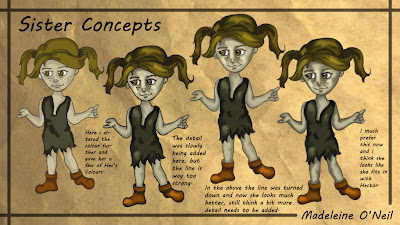
I tried again with designing Hector as i wasn't very happy with the way he was coloured, i don't think it looked right with out a black line around him.


Above i tried the colouring again and made a subtle black line. This works much better now, he looks more human finally!


Once i found my technique for colouring in Hector it was much easier to design Hattie now that i had the ground work done. This is her above, i think she matches Hector well and think they sit quite well together.


This is one of the key backgrounds to the game, this is where Hector and Hattie were living with their parents before they were taken from them. i was going to colour this in quite detailed but thought it looked and translated much better as a grayscale concept design.


 The next key scene would be the tavern, where they can use this as a bit of a portal to travel to different environments within the game.
 Although on the brief we had written there wasnt anything about designing a courtyard but i felt the town needed an area where potential chases and sword fights could take place.
Again with same prinicpal this environment was not on the brief but i thought this would be a cool place to have a chase and also the characters needed an place to buy things like weapons, i was kind of bearing 'Nocturn Alley' in mind from Harry Potter.


I was not initially going to design this scene but when we got together as a collab group we thought it would be best to have two people sticking to characters and two people to do backgrounds as this was an easier way to make sure that all our work fit together nicely.


And.........here are all our characters finally put together in a line up! I think they look pretty good as a whole and fit together well.


Same goes for the backgrounds, here they all are, i think the backgrounds fit a lot better together, the gray scale is a really cool effect!

Production - Personal Project Environments

Below are the environments that the coaster will travel through, variuos things will happen to the riders as they travel through the manor.


This is the 'Fury Float', this is what riders will sit on to travel through Surrell Manor.


This is the main entrance where people will queue and hop aboard the Fury Float.


Children's room


Dining Room


Kitchen


Bathroom


Office


Mr Finch - the evil man who was trying to knock down the orphanage, and consequently kills everyone in it.


Mrs Surrell - the young lady who owns the orphanage.


This is a little promo poster i did for the ride, i could see this plastered over theme parks.

Monday, 23 April 2012

Production - Book Design

The finished product for major project is an 'Art Of ' book for the film i have designed, so i have started to piece together the book pages.


This above is the front cover, i didn't want anything too detailed on the front as i didn't want to give too much away in the early stages, but i think it's enough to realise what the story is about.


Above is how the character pages will progress, there will be an opeing profile on each, a development sketches page, followed by a final drawings page then lastly that character's turnaround. This is how it will be laid out for each character.


This is the preset that the environment pages will be set upon, some rough development on the left with a little bit of information on the tag explaining the scene, then on the right will be the final image.


After the environments will be a seperate page for the floor plan to tie the environment section up.


There will then be a title page for the vehicles then there will be a page each for the vehicles, laid out like above with the vehicle information and who rides it.

Wednesday, 28 March 2012

Personal Project

Also as a sub section in Major Project we are to do our own personal project which can pretty much be anything but has to be done in a style you have not tried before. Back in second year i loved doing the title sequence for 'Dexter', i liked the darkness of it all so wanted to bare that theme in mind again. After much thought i decided that i would do the concept work for a ghost train of my own. My ghost train will travel through an abandoned orphanage, i want it to be creepy yet quirky so have decided to do it with the 'Angry Birds' style in mind. From this i want clear design imagery and an After Effects little title sequence for riders to see when they are queueing up for the ride, which i have named 'Disturbed'.

The following designs are for the rides logo, i knew i wanted it to have something to do with an orphanage.


This is the final logo i am really happy with it, it is relevant and does not give too much away. If i saw this on a ride i would be creeped out.


Now for the backgrounds, i am going to do some concepts for the key environments within the orphanage and a couple of storyboards to show how the coaster moves around each of those places.

I wanted an establishing shot of the orphanage, which is where the public would queue as well.


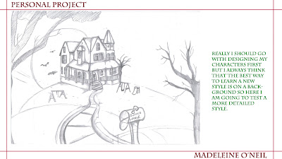
This was my first attempt at the establishing shot and although i really like it, it took two days to complete and i did not really feel i was pushing myself with a style i had not tried before, so i did some more stylistic reasearch and thought it would be cool to try a background in the 'Angry Birds' style.......


So this was my second attempt in a different style and i have to say i am really very happy with this, i have never drawn in this style and i actually felt quite comfortable doing it this way. I think it captures mood perfectly and helps make the ride appeal to a wider audience.


Collab!

As part of our module we have to collaborate with some other students, so a few of the girls and myself in the art strand have decided to come up with our own brief and do the design work for a game and design everything as if it were for a pitch. The game is about a little Brother and Sister who are on a quest to find their missing Mother and Father, however stopping them is the Mother's evil sister. Collectively we have drawn up what we want from this project and assigned different jobs to each other. I am designing the little boy, girl and their Mother and two of the key backgrounds. We all decided that we would like the style of the game to be in keeping with current games like 'Zelda' and 'Fable'.


We would really love to print out some A3 sized character boards like in the above research, they were for 'Fable'.


I have never really painted in Photoshop using this type of style, i usually rely heavily on black outlines and solid colour so these were a nice challenge.


I tried again with designing Hector as i wasn't very happy with the way he was coloured, i don't think it looked right with out a black line around him.


Production - Backgrounds, Vehicles And Props

Okay i think for the time being i am going to leave characters and continue with my backgrounds, vehicles and props, obviously characters will return once i am done with backgrounds and i start to put the characters within them. The backgrounds will read more like a storyboard so the viewer knows what is going on.


I have done some night variations of some of the scenes where i thought it would look good, above is the circus establishing shot but at night.


After doing all the inside shots it was important to do a line up of all the huts, so this above is what the staff quarters of the circus would look like.


It's crucial to have a floor plan to see where all these buildings go, above is the floor plan for Cirque Cortez with all the huts, Circus and other amusements on it.


Props are sometimes what can really bring a scene to life, i've ried thinking outside the box and not just designed things you would definately see at the circus. Here are the props below.


I have given each of the animals their own merchandise so they all have their own baseball caps.


Now onto vehicles, i have tried to make them as quirky as possible. On each page i have included what the vehicle does and who would ride it.


There will be quite a lot of signs posted around the circus, mainly directional information. Here are the final signs.


I didn't really like the direction my logo went in pre-production, i don't feel it fitted with the whole theme so i went back and completely re-designed it.


And here above is the final logo, i am much happier with the way this looks and i think it now fits with the overall theme!